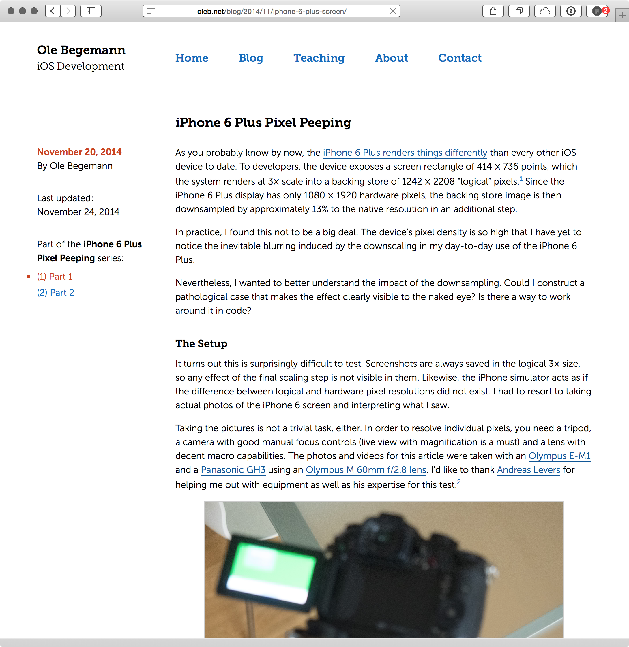
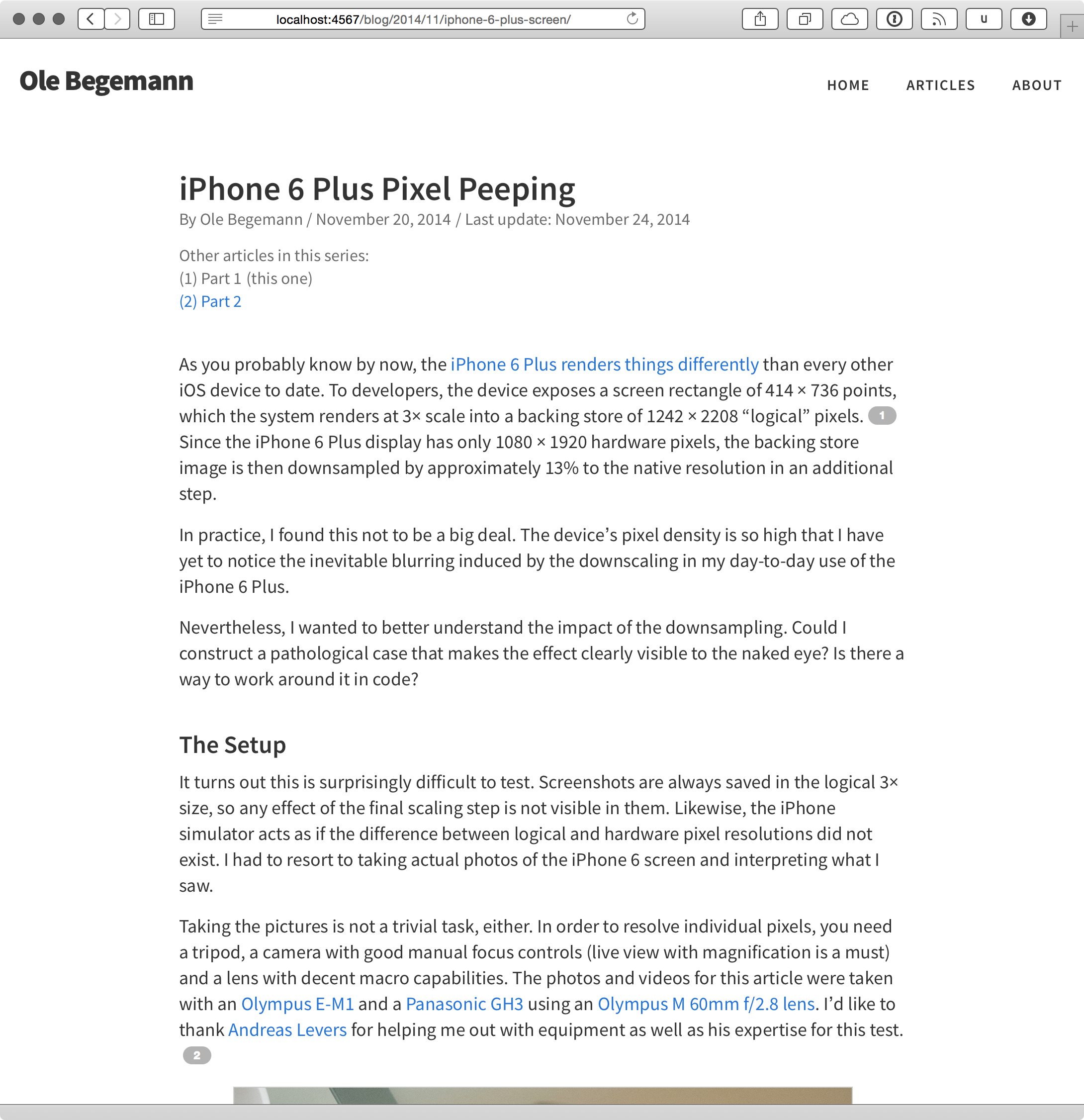
I redesigned my site. If you are reading this, you should already see the new design. These are the highlights:
-
Responsive layout for mobile devices. Finally.
-
Dynamically resizing images to the viewport width. Check out UIKonf 2014 Talks for an example.
-
Footnote popups1 with bigfoot.js. This is another thing I had wanted to add for a long time.
Beside the responsive layout, my main goal for the redesign was to further clean up the article pages as those are where my readers spend the vast majority of their time. Switching to a single-column layout without a sidebar gives me the flexibility to make images wider than the text when necessary. This layout also works great with the double-tap-to-zoom gesture in many browsers.
Every article on the web should include the date it was published and the name of the author.
The information I show on the article pages is very deliberately chosen. In my opinion, every article on the web should include the date it was published and the name (or pseudonym) of the author. This information is so important that it should appear at the top right next to the headline.
The date is essential to allow the reader to assess the information in the article. Knowing the time when something was written is essential to evaluate it. Some very successful people disagree with this. They argue that by putting a date on an article whose contents are fundamentally timeless you devalue it because future readers will automatically assume it is out of date. That may be true, but you should let your readers be the judge of that. If your piece really is timeless, it will be recognized as such. Omitting the date is a disservice to your readers.
Why is the author’s name important? People will want to share your articles on social networks and mention you there. They may not do that if they can’t find your name. Ideally, you should also include the author’s Twitter handle (or their username on other social networks) for easy mentioning – this is something I plan to do but haven’t gotten around to yet.
People will want to share your articles on social networks and mention you there. They may not do that if they can’t find your name.
Any other items on the page distract from the actual content and should be kept to a minimum. I used to have a prompt for readers to follow me on Twitter and subscribe to my feed on every page, but I got rid of it in the redesign. Removing all non-essential content has another subtle but important benefit: the reader can very accurately judge the length of the article by looking at the size of the scroll indicator. Having a long comments or footer section on the page would work against that.
As before, I wrote all the HTML and CSS myself. I switched to Middleman as my static site generator a while ago and I really like it. I’m a big fan of having a static site that I can easily version with Git without the hassle of a database. I need to figure out a better way to quickly post from other devices than my Mac, though.
I chose Adobe’s Source Sans Pro as the font for both body and headlines. It’s freely available and very readable in my opinion. Code is rendered in Source Code Pro from the same family.
I also used this opportunity to rework many areas of my CSS with flexbox. Once I had grasped the basic concepts, I found working with the flexbox model much easier and more predictable than float-based layouts. It’s pretty great. Browser support is really good, too (you still need the -webkit prefix for Safari). I encourage you to check it out if you haven’t already. It turns out flexbox knowledge is even useful for app development!
I’d welcome your feedback on the new design, especially if you encounter errors or glitches on your browser or device. Please email me.
The old design:
And the new one:
-
Like this one. ↩︎

