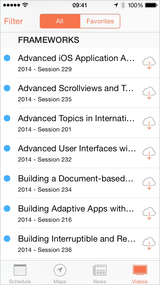
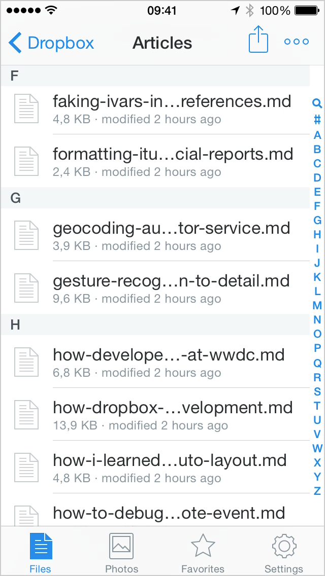
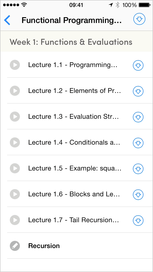
Truncated text is ubiquitous in mobile user interfaces. Especially in list views, too many apps cut off text after just one or two lines although the relevant text is often longer. This is almost always annoying, but it can easily become a real problem and even render a UI pretty much unusable (think of a list of search results that all begin with the same text, for example). I consider truncated text to be one of the most glaring design failures of current mobile UIs.1
I consider truncated text to be one of the most glaring design failures of current mobile UIs.


As an app developer or designer, you should treat most cases where you conveniently resort to truncating text as a failure in your design. There are certainly exceptions to this, and especially if you deal with user-generated content you have to set a limit—nobody wants item titles spanning a dozen lines or more. For “normal” content, however, the default should be to display the full text. If that means an item title requires four lines, then give me four lines.
Update March 2, 2015: And Dynamic Type makes it even more important to make sure that your design works well with text of any length or size.
Your items will take up more vertical space that way, but who cares? Coding table views with variable row heights is a solved problem. And vertical scrolling is the most natural and effortless gesture we have, so you should not be afraid to use it.
A drawback of this approach is that list views with variable-height rows can appear unbalanced or cluttered. Designing such a list that looks great is hard, but I think it is absolutely worth the effort.
If you really think you need truncated text, you should at least provide the user with a way to see the whole thing without having to leave the current screen. Apple used to do this in the Music app. A long tap on a truncated song title would display a popover with the full title. This feature is gone in iOS 8, however. Another option might be to let users expand text by tapping on the ellipsis, but I still think these workarounds are worse than just showing the full text from the start. Oh, and please stay away from horizontally scrolling marquee labels, they are extremely annoying.
-
And not just mobile UIs. Xcode is a great example of a desktop app that uses text truncation in way too many places. Who thought it was a good idea to truncate error messages? The Finder is another app that I’d like to embrace multiline labels for long filenames. ↩︎

