I have long felt that Apple’s official iOS sample code lacked examples of good, scalable app architecture. I do not mean this as a general criticism of the existing sample code projects. It is the nature of sample apps to be very small; they let you get away with architecture designs (such as putting everything in the view controller) that quickly break down in larger projects. Moreover, the goal of most sample code is to illustrate one specific feature or technique, and it is totally understandable for the author to take shortcuts in other areas in order to save time. I do the same on my blog all the time. At times, these shortcuts might even aid in understanding the central piece of the code by not focusing on the “uninteresting” parts.
Nevertheless, I think there is a real need for spreading app architecture best practices in the iOS community. The average app has grown significantly in complexity over the past years, and I suspect most projects eventually reach a point where gigantic view controllers just don’t cut it anymore (if they ever did). What is the best way to avoid that situation? I know I still struggle with this question despite having quite a bit of experience with the platform. Apple could lead the way by publishing sample code that focuses on clean, scalable app architecture — and it seems they just took a step in that direction.
WWDC 2014 Session 232
In WWDC 2014 session 232, Advanced User Interfaces with Collection Views, Apple engineer Jeff Watkins talks about the architecture of the recently released version 3.0 of the iTunes Connect iOS App. The talk is accompanied by a fairly complex sample project called AdvancedCollectionView-1.0, which, as Jeff points out in the talk, is directly derived from the code and architecture of the actual iTunes Connect app. This may be the closest thing we have to the source of an actual app directly from Apple.
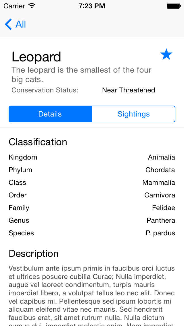
The sample app works like your typical productivity app that displays master-detail data in a navigation controller hierarchy. All content is laid out in collection views. The app simulates networking by loading all content from local JSON files with a one- or two-second delay. It does not cache downloaded data on disk at the moment.
Reduce View Controller Complexity
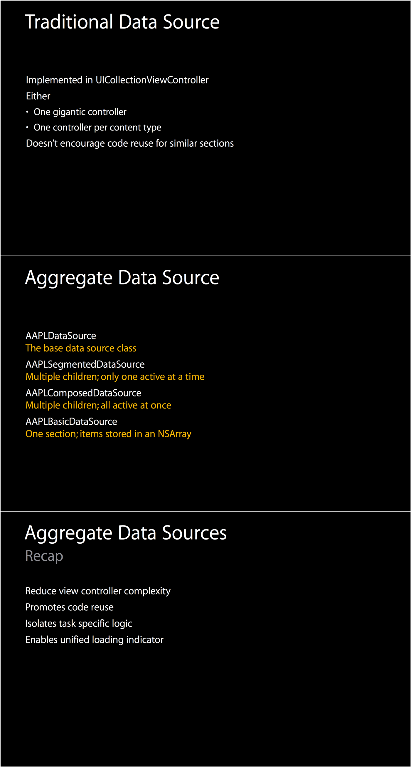
In the first part of the session, Jeff talks about the overall architecture of the iTunes Connect app. The team found that the traditional approach of having view controllers be the collection view’s data source not only leads to bloated view controllers. It also inhibits code reuse for similar sections of content in different views. The solution is to implement your table or collection view data sources as separate objects. If you read objc.io, this is not news to you.
Composite Data Sources
The team took this idea one step further. They created separate data source classes (all derived from AAPLDataSource for small, recurring sections of their designs (such as the segmented control, or a list of key-value pairs). By placing these data sources in a hierarchy of data source objects that reflects the layout of the content, they were able to compose complex views out of small, reusable components. The root object of the hierarchy then acts as the data source for the collection view and aggregates the content it receives from its children.
The data sources are also responsible for managing the loading of their content over the network. This design makes it trivial for the data sources to not only control the “normal” content of the collection view, but also how the view presents itself when it is empty (it shows a nicely designed placeholder text), during loading, or when an error occurred — with no additional code whatsoever in the view controller.
I encourage you to watch the entire session. I only talked about the first part here, but it continues with a fairly in-depth discussion how to implement custom collection view layouts. I look forward future updates to the sample app, which Jeff already hinted at.

