I have one more thing to say on the relative sizing view modifier from my previous post, Working with percentages in SwiftUI layout. I’m assuming you’ve read that article. The following is good to know if you want to use the modifier in your own code, but I hope you’ll also learn some general tidbits about SwiftUI’s layout algorithm for HStacks and VStacks.
Using relative sizing inside a stack view
Let’s apply the relativeProposed modifier to one of the subviews of an HStack:
HStack(spacing: 10) {
    Color.blue
        .relativeProposed(width: 0.5)
    Color.green
    Color.yellow
}
.border(.primary)
.frame(height: 80)
What do you expect to happen here? Will the blue view take up 50 % of the available width? The answer is no. In fact, the blue rectangle becomes narrower than the others:
This is because the HStack only proposes a proportion of its available width to each of its children. Here, the stack proposes one third of the available space to its first child, the relative sizing modifier. The modifier then halves this value, resulting in one sixth of the total width (minus spacing) for the blue color. The other two rectangles then become wider than one third because the first child view didn’t use up its full proposed width.
Update May 1, 2024: SwiftUI’s built-in containerRelativeFrame modifier (introduced after I wrote my modifier) doesn’t exhibit this behavior because it uses the size of the nearest container view as its reference, and stack views don’t count as containers in this context (which I find somewhat unintuitive, but that’s the way it is).
Order matters
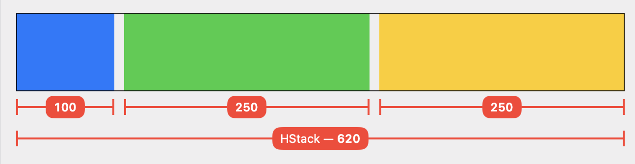
Now let’s move the modifier to the green color in the middle:
HStack(spacing: 10) {
    Color.blue
    Color.green
        .relativeProposed(width: 0.5)
    Color.yellow
}
Naively, I’d expect an equivalent result: the green rectangle should become 100 pt wide, and blue and yellow should be 250 pt each. But that’s not what happens — the yellow view ends up being wider than the blue one:
I found this unintuitive at first, but it makes sense if you understand that the HStack processes its children in sequence:
-
The HStack proposes one third of its available space to the blue view:
(620 – 20) / 3 = 200. The blue view accepts the proposal and becomes 200 pt wide. -
Next up is the
relativeProposedmodifier. The HStack divides the remaining space by the number of remaining subviews and proposes that:400 / 2 = 200. Our modifier halves this proposal and proposes 100 pt to the green view, which accepts it. The modifier in turn adopts the size of its child and returns 100 pt to the HStack. -
Since the second subview used less space than proposed, the HStack now has 300 pt left over to propose to its final child, the yellow color.
Important: the order in which the stack lays out its subviews happens to be from left to right in this example, but that’s not always the case. In general, HStacks and VStacks first group their subviews by layout priority (more on that below), and then order the views inside each group by flexibility such that the least flexible views are laid out first. For more on this, see How an HStack Lays out Its Children by Chris Eidhof. The views in our example are all equally flexible (they all can become any width between 0 and infinity), so the stack processes them in their “natural” order.
Leftover space isn’t redistributed
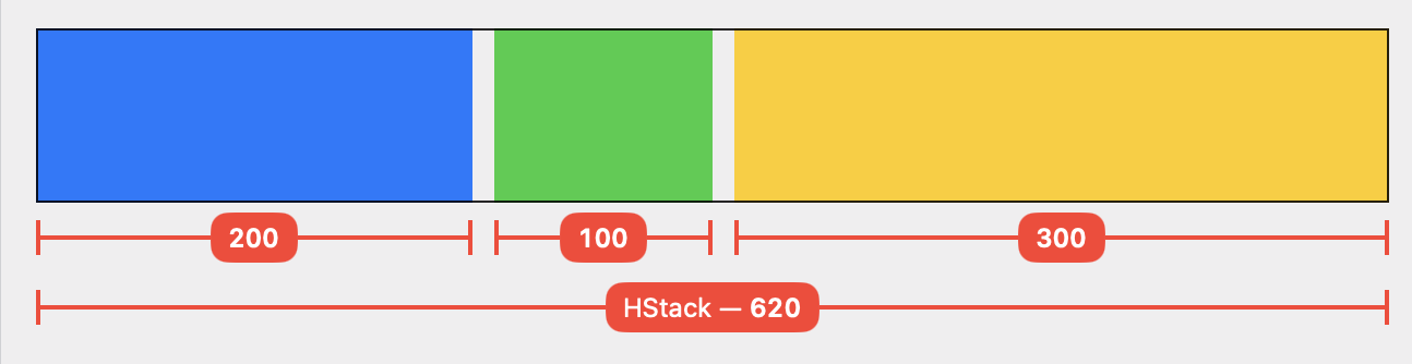
By now you may be able guess how the layout turns out when we move our view modifier to the last child view:
HStack(spacing: 10) {
    Color.blue
    Color.green
    Color.yellow
        .relativeProposed(width: 0.5)
}
-
Blue and green each receive one third of the available width and become 200 pt wide. No surprises there.
-
When the HStack reaches the
relativeProposedmodifier, it has 200 pt left to distribute. Again, the modifier and the yellow rectangle only use half of this amount.
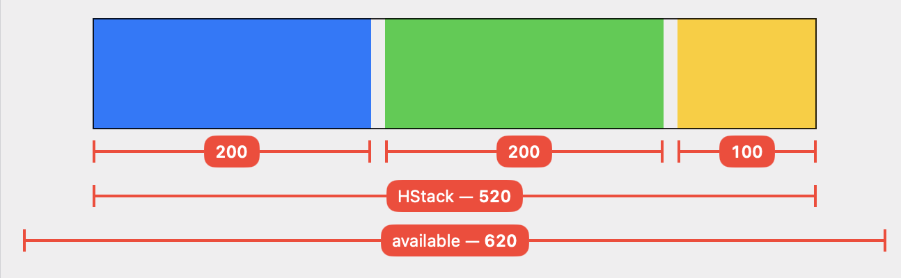
The end result is that the HStack ends up with 100 pt left over. The process stops here — the HStack does not start over in an attempt to find a “better” solution. The stack makes itself just big enough to contain its subviews (= 520 pt incl. spacing) and reports that size to its parent.
Layout priority
We can use the layoutPriority view modifier to influence how stacks and other containers lay out their children. Let’s give the subview with the relative sizing modifier a higher layout priority (the default priority is 0):
HStack(spacing: 10) {
    Color.blue
    Color.green
    Color.yellow
        .relativeProposed(width: 0.5)
        .layoutPriority(1)
}
This results in a layout where the yellow rectangle actually takes up 50 % of the available space:
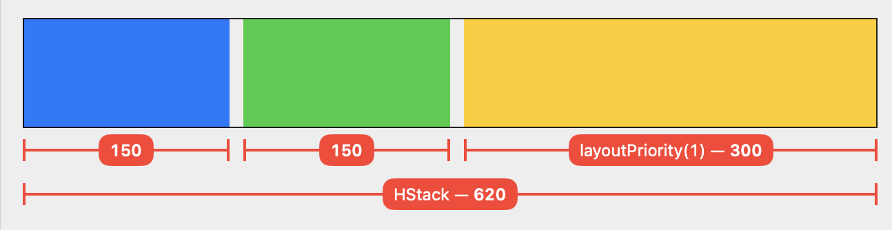
Explanation:
-
The HStack groups its children by layout priority and then processes each group in sequence, from highest to lowest priority. Each group is proposed the entire remaining space.
-
The first layout group only contains a single view, our relative sizing modifier with the yellow color. The HStack proposes the entire available space (minus spacing) = 600 pt. Our modifier halves the proposal, resulting in 300 pt for the yellow view.
-
There are 300 pt left over for the second layout group. These are distributed equally among the two children because each subview accepts the proposed size.
Conclusion
The code I used to generate the images in this article is available on GitHub. I only looked at HStacks here, but VStacks work in exactly the same way for the vertical dimension.
SwiftUI’s layout algorithm always follows this basic pattern of proposed sizes and responses. Each of the built-in “primitive” views (e.g. fixed and flexible frames, stacks, Text, Image, Spacer, shapes, padding, background, overlay) has a well-defined (if not always well-documented) layout behavior that can be expressed as a function (ProposedViewSize) -> CGSize. You’ll need to learn the behavior for view to work effectively with SwiftUI.
A concrete lesson I’m taking away from this analysis: HStack and VStack don’t treat layout as an optimization problem that tries to find the optimal solution for a set of constraints (autolayout style). Rather, they sort their children in a particular way and then do a single proposal-and-response pass over them. If there’s space leftover at the end, or if the available space isn’t enough, then so be it.