Apple kicked off this winter’s iOS 5 Tech Talk World Tour last week in Berlin. I was lucky enough to get a seat and I’d like to tell you a bit about the sessions I attended for those who weren’t there.
First up after the kickoff session was Mark Kawano, Apple’s User Experience Evangelist. He talked about iPhone and iPad User Interface Design, in particular:
Understanding what makes the iPhone and iPad so special is essential to designing a great user experience. Learn best practices for optimizing your app’s user interface for the unique characteristics of iOS devices.
Great Apps Tell a Story
Mark opened his talk by reminding the audience to strive to build a truly great app. Great apps like djay or The Early Edition 2 define a new benchmark for their genre. The attention to detail that went into such apps helps them to remain successful on the App Store over a long period of time. And looking at how relatively small the teams behind those highly successful apps often are, there is no reason why any one of us couldn’t build a truly great app, too.
Your main goal should be telling a great story.
One common theme of great apps is that they tell a story. In fact, telling a great story should be your main goal during the design of your app. Your app’s story should drive most if not all of your design decisions. The story answers questions like:
- What will your app do?
- Who are the users?
- Where will they use it?
Concrete Advice
Mark continued with some concrete steps you should follow while designing your app, always driven by the story you have defined.
1. Define Your App’s Style
Ask yourself two questions in this section:
What type of app are you building?
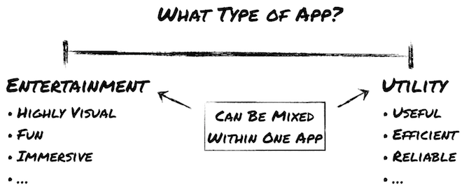
Depending on where you place your app on this line, you should tend to make your app more or less visually rich and immersive, and make different tradeoffs between stunning looks that may be lots of fun but a bit harder to use and a UI that is optimized for usefulness, efficiency and reliability (no surprises). Sounds like common sense, and it probably is.
A not so obvious insight is that you can (and should) make a different decision for each screen of your app. If your app exposes different characteristics on its different screens, you should optimize each screen for its intended purpose. Take Apple’s Photos app on the iPhone as an example: the albums navigation is a plain table view that looks rather boring but is efficient in letting you find the photos you’re looking for. Once you have selected a photo for viewing, the app turns into a totally immersive experience, hiding all navigation controls.
What kind of content does your app have?
The design of your app’s UI should be heavily influenced by the type and amount of content you want to display.
-
Photos and Videos: should always be shown full screen (at least on second tap); let the content shine; hide all UI controls; reduce color in the UI to focus on the content; should be able to swipe between fullscreen items.
-
Large data sets: focus on legibility: align text at common edges; when displaying data fields,right-align the label and left-align the content (as in the iPhone’s Contacts app); use one typeface only, with subtle shading and size differences to visualize importance; minimum font size should be 13 pt for short and rather unimportant snippets, 15 pt for normal body text; make navigation easy; have great visual design.
-
Minimal data: make it graphically rich; use realism where appropriate. (An example of this type of app is the iPhone’s Compass app: it only displays a single piece of information; another example would be a thermometer app that only displays the today’s current, highest and lowest temperature.)
-
Games: graphics must be beautiful; be consistent: menu screens should look just as good as the actual gameplay; use playful typography: Helvetica is probably not the font you want to use in a game; customize the Game Center UI to make it fit with the rest of your game’s appearance.
To me, the HIG are more of a cookbook than a checklist.
General Tips
-
Customize your UI for both iPhone and iPad: the iPad version should not just be a blown-up version of your iPhone UI. Make use of the bigger screen and display more information per screen.
-
Use the new appearance customization APIs in iOS 5: just because you use the standard UIKit controls doesn’t mean you can’t make your app graphically rich.
-
Read the Human Interface Guidelines, which have been heavily updated for iOS 5. Mark stressed that he understands the HIG as being
more of a cookbook than a checklist
. He encouraged the audience to try to understand the concepts and ideas that stand behind the rules in the HIG and then adhere to these ideas rather than following every rule to the letter.
2. Design for Touch
Tap Targets
Everybody who has used an iOS device knows that the finger is a vastly different input device than a mouse or trackpad. Not only is a touchscreen a more direct form of interacting with an app, our fingertips are also a lot less accurate than a mouse pointer that can be positioned with pixel precision.
Mark recommends that tap targets should be at least 44 × 44 pt in size and have adequate spacing between them. If in doubt, have a look at Apple’s Calculator app on the iPhone to check how big a fingertip-sized control should be.
Gestures
Just as important as tapping are gestures. Your app should support all of the common gestures that users have learned to rely on as long as they make sense in the context of your app. Gestures include:
-
Swiping. A swipe must feel like direct manipulation of the objects on the screen. Responsiveness is therefore extremely important. You should provide visual indicators (such as a
UIPageControl) to show the user between how many items she can swipe. To avoid confusion, it is important that the items she can swipe between are all on the same hierarchical level. When swiping between photos in an album, don’t include a screen showing a list of all albums. -
Scrolling. Scroll bars are hidden most of the time so it is important to show the user that the content is scrollable. For example, Apple always makes sure in its own apps that table views include a partly visible row at the bottom of the screen. The clipped content tells the user that there is more to discover. Another subtle indicator is flashing the scroll indicators briefly when a scrollable view appears on screen.
One drawback of gestures is that all but the most trivial gestures are not easily discoverable. It is important to not hide key functionality behind gestures. Your app should also offer a more discoverable method (e.g., a button) to achieve the same thing.
Touch-centric UIs
If you want a real challenge and make a great jump towards a great app, you should try to create a totally touch-centric UI. Move away from buttons and other controls (which are, after all, just layers of abstraction) and try to design a way for users to interact directly with your content. In the best case, your app does not even have a UI anymore!
As examples of apps that made great progress in this regard, Mark cited Push Pop Press’s Our Choice (for making the entire UI go away) and Visible Market’s StockTouch (for introducing a completely fresh way of visualizing and interacting with stock market data).
3. Use Animation
Animations are more than just eye candy. If properly used, they really help a user understand what’s going on in your app. Smooth Transitions between screens make it easier for users to keep track of where they are in the hierarchy of screens. Users know that a right-to-left transition means they moved down in the navigation hierarchy as opposed to going back up. A zoom transition from thumbnail size to full screen when the user taps a photo shows him direcly what’s happening.
Animations can also be used with the all-important task of responding to touch input immediately: Imagine your user taps a row in a table view that causes your app to download additional data to display on a detail screen. It is important to immediately do the transition animation to the detail view and show the animated activity indicator even if you can’t display any new content until the download has finished. Nothing would be more jarring to the user than giving him the feeling that your app did not react to his touch input.
A third important use of animations is to provide feedback in certain situations, for example if the app has entered a new mode. A good example of this is the wiggle animation in Springboard when the app icons are ready to be moved.
4. Focus!
This is really important to make your app as good as possible: Determine your app’s essential features and concentrate on those! There is always time to add more features later (when your users have told you which ones they really want). In the initial design and development phase, your time is best invested by polishing a limited feature set to perfection.
Determine your app's essential features and concentrate on those!
The example to follow here is Ben Zotto’s iPad app Penultimate, an app that launched on the iPad App Store on day one with a pretty limited featureset but highly polished UI. Largely due to its great design, Penultimate has always been high in the App Store charts, giving the developer time to add highly requested features one by one.
5. Prototype and Iterate
In all likelihood, you will not arrive at the perfect design with your first attempt. Nor with the second or third. This is a process that takes time, and you should constantly prototype and iterate to make sure your design feels right
. Don’t worry too much about the tools to use for this process. Any tool you feel comfortable with that allows you to make quick changes is great. Mark mentioned that internally at Apple, many love Keynote for building quick click prototypes, especially for its great built-in animations. For the more code-oriented designers, Xcode’s new Storyboarding feature might be the way to go.
Mark stressed the importance of testing your UI on an actual device. Nicholas Zambetti’s free LiveView app is his tool of choice to quickly bring a design mockup from your computer screen onto a device screen.
6. Have a Great App Icon
Your app’s icon is the first thing a potential customer notices about your app. And after they have bought it, the icon will be a constant companion and your app’s main identifier on a crowded Springboard. So make sure it’s great!
Mark offered a nice little tip to test the recognizability of your icon. Place it into a folder in Springboard. If it can still be recognized easily among other icons in the folder, chances are it is also very recognizable at a larger size.
Is It Apple Quality?
Finally, this is the question you should ask yourself constantly: Is my app Apple Quality? Remember, there is no reason why your app shouldn’t be as good as Apple’s own iOS apps. So if your answer to the question is no, you should probably work harder on your app’s design.