As you probably know by now, the iPhone 6 Plus renders things differently than every other iOS device to date. To developers, the device exposes a screen rectangle of 414 × 736 points, which the system renders at 3× scale into a backing store of 1242 × 2208 “logical” pixels.1 Since the iPhone 6 Plus display has only 1080 × 1920 hardware pixels, the backing store image is then downsampled by approximately 13% to the native resolution in an additional step.
In practice, I found this not to be a big deal. The device’s pixel density is so high that I have yet to notice the inevitable blurring induced by the downscaling in my day-to-day use of the iPhone 6 Plus.
Nevertheless, I wanted to better understand the impact of the downsampling. Could I construct a pathological case that makes the effect clearly visible to the naked eye? Is there a way to work around it in code?
The Setup
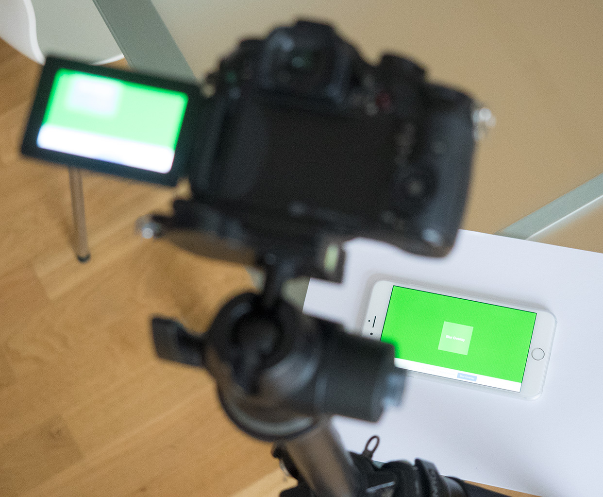
It turns out this is surprisingly difficult to test. Screenshots are always saved in the logical 3× size, so any effect of the final scaling step is not visible in them. Likewise, the iPhone simulator acts as if the difference between logical and hardware pixel resolutions did not exist. I had to resort to taking actual photos of the iPhone 6 screen and interpreting what I saw.
Taking the pictures is not a trivial task, either. In order to resolve individual pixels, you need a tripod, a camera with good manual focus controls (live view with magnification is a must) and a lens with decent macro capabilities. The photos and videos for this article were taken with an Olympus E-M1 and a Panasonic GH3 using an Olympus M 60mm f/2.8 lens. I’d like to thank Andreas Levers for helping me out with equipment as well as his expertise for this test.2
UIKit/CoreGraphics
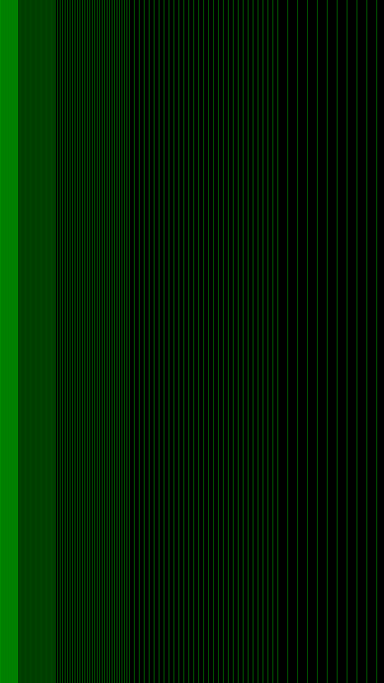
To visualize the effects of the downsampling, I wrote a test app that renders a grid of vertical green hairlines with varying spacing on a black background using CoreGraphics. Choosing green instead of white (red or blue would have worked just as well) makes it easier to interpret the photos. White lines with their red, green and blue subpixels would have been somewhat harder to make sense of at large magnifications, but it would not have changed the overall results.
Rendering at the Logical 3× Scale
Using the 3.0 scale factor reported by the device, I chose a line width of 1/3.0 (= 1 logical pixel). Since line widths in CoreGraphics extend to both sides from the center line, it is important to offset each line by half the point size (1/3.0 * 0.5) to make them fall on a single pixel.
I verified the correctness of my drawing code by using the same code to render directly into an image of 1242 × 2208, saving it to disk, and inspecting it in Photoshop. (You can obtain the same result by taking a screenshot on the device.) As you can see, the lines are perfectly crisp:
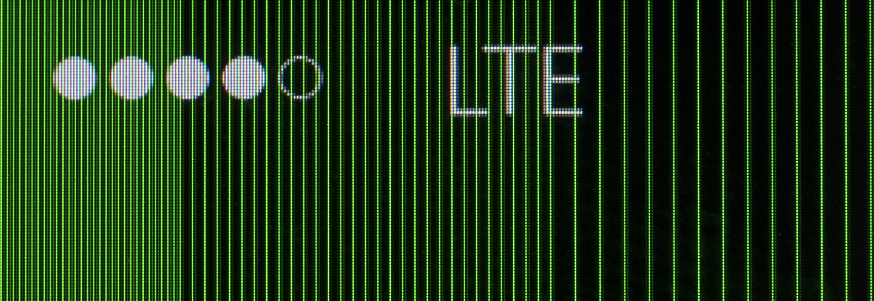
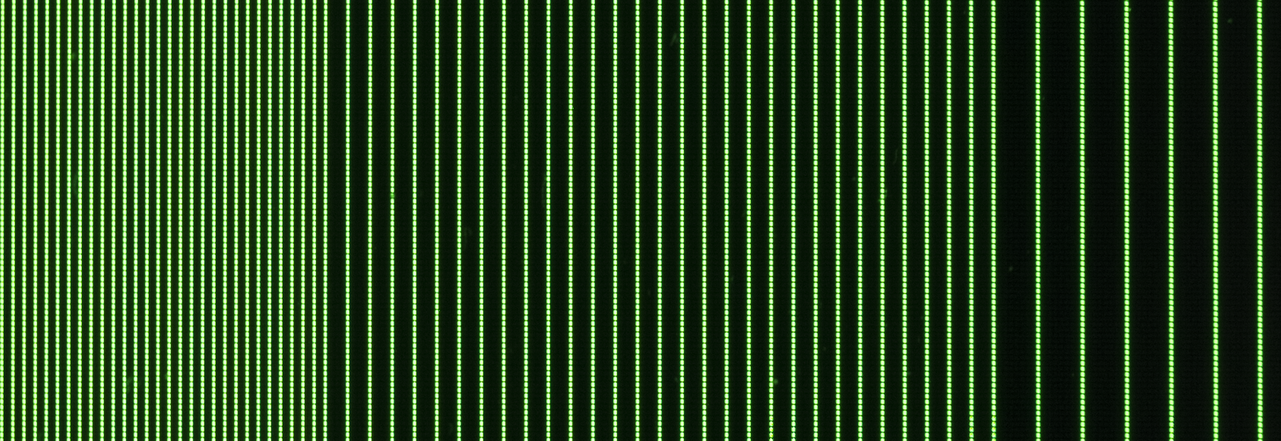
The device now downsamples the crisp 1242 × 2208 pixel image for display on the 1080 × 1920 pixel screen. This is a photo of the screen:
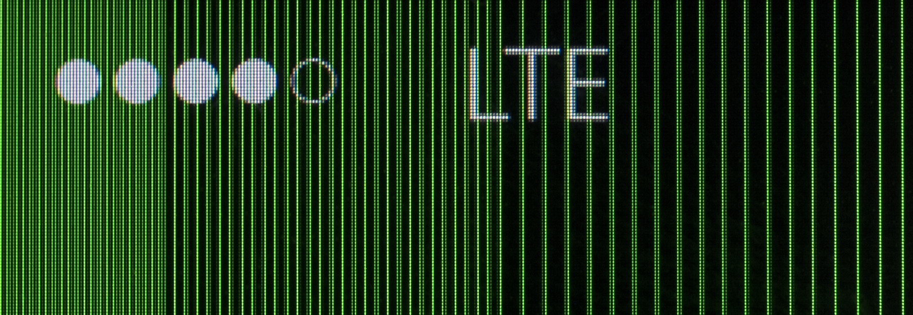
You can see that the lines are not pixel-perfect. Each line bleeds over into neighboring pixels with varying intensity (i.e., brightness). Naively, I had expected a different outcome. Downscaling a bunch of perfext 1-pixel lines by 13% should result in lines that are narrower than 1 pixel, not wider. Since the system can’t draw less than a pixel, it would compensate by drawing the lines at full 1-pixel width but at slightly lower brightness. I had not accounted for the fact that the lines do not lie on pixel boundaries after scaling, and that explains the observed result.
Although the test pattern looks very bad at this extreme magnification, it’s worth noting that the impression with the naked eye is not that bad. It’s hard to capture in a photo, but the line pattern looks mostly regular and lines appear crisp (I can’t discern individual pixels). A very subtle Moiré pattern is visible but it’s hard to tell what causes it.
Only a direct comparison against the result produced on a device that does not have the scaling step (an iPhone 5 in this case) shows a striking difference. The lines are perfectly crisp and much brighter than on the iPhone 6 Plus. This is how it is supposed to look!
Rendering at Hardware Scale
I wondered if I could do better by taking the device’s native scale into account when I draw the test pattern. The new UIScreen.nativeScale property in iOS 8 provides the necessary information. On an iPhone 6 Plus, the nativeScale is 1080 px/414 pt ≈ 2.609 px/pt (on all other devices, nativeScale is equal to UIScreen.scale).
I thought that by drawing lines with a width of 1/2.609 ≈ 0.38333 pt (resulting in a line width of exactly one pixel on a 1080 px wide surface), I could essentially trick the scaler and get a pixel-perfect result. That did not turn out to be true, and in hindsight it’s pretty clear why: each line segment (0.38333 pt wide) is first scaled up by a factor of 3 and rendered into a bitmap. The resulting lines (now 1.15 px wide) will necessarily become blurry and no subsequent downsampling can compensate that.
The end result on screen is not identical to the case presented above but quite similar. In fact, although the magnification looks a bit better to my eye than the 3× rendering, it looks slightly worse at a normal viewing distance.
OpenGL
Apps that use OpenGL or Metal for rendering can opt out of the scaling stage and draw directly into a renderbuffer that has the native screen dimensions. All you have to do is to set the contentScaleFactor of your GLKView to the value of UIScreen.nativeScale (the OpenGL ES/Metal project templates in Xcode do this by default). This is an important performance optimization as more pixels generally means lower framerates.
You can use Instruments to confirm that your view correctly skips the scaling stage. Your view should be rendered with a blue overlay when the “Color Compositing Fast-Path Blue” option is checked in the Core Animation instrument. If you don’t see the overlay, the view is not set up correctly.
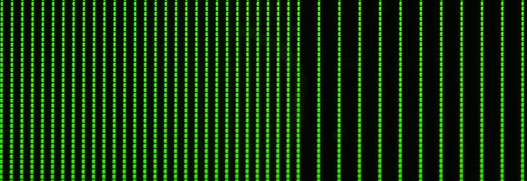
Rendering the test pattern using OpenGL at the native hardware resolution yields a perfect result. The lines are very bright and there’s no bleeding into neighboring pixels. In direct comparison with the plain UIKit results above, it is astonishing how much better this looks.
Blending Views
If views can render at different scales on an iPhone 6 Plus, how does the system handle situations where it has to blend a (native scale) OpenGL view with a normal UIKit view? These views don’t even have to be part of the same app. Even games that are fully OpenGL-based will have to interact with system views such as the status bar, alert views, Control Center, Notification Center, or the volume overlay.
I tested this by overlaying the OpenGL view that renders the grid, first with a standard UIView whose alpha value was set to 0.5, and second with a UIVisualEffectView that was configured with a light blur effect.
Again, the results are fascinating:
-
Adding the alpha overlay has no effect on the OpenGL view. The system can do simple alpha blending with views of different scale factors, presumably because the compositing happens directly on the GPU after the overlay view went through the scaling stage.
-
Activating the blur view immediately degrades the image quality of the line grid. It seems the system now has to upsample the OpenGL view to the logical 3× scale in order to compute the blur before it eventually downsamples everything to the hardware resolution.
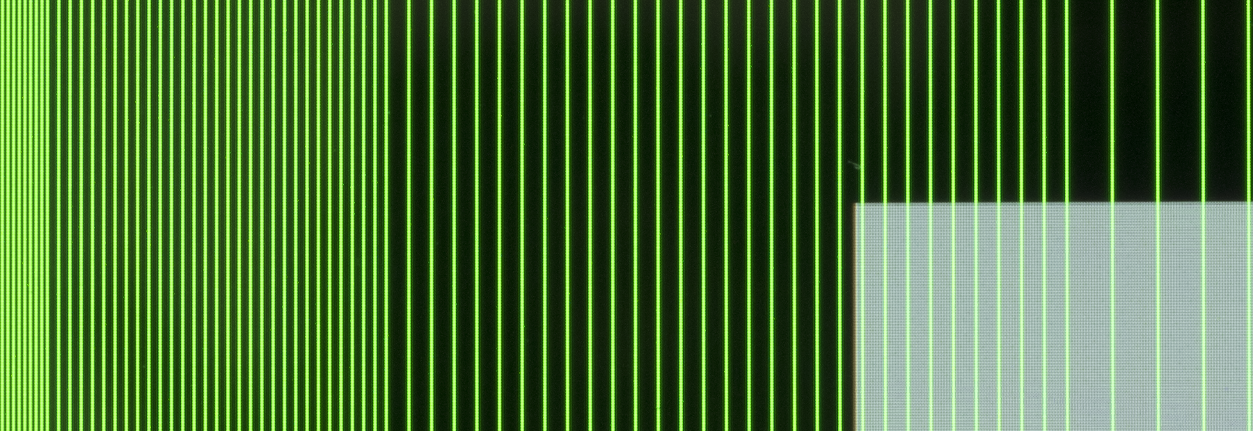
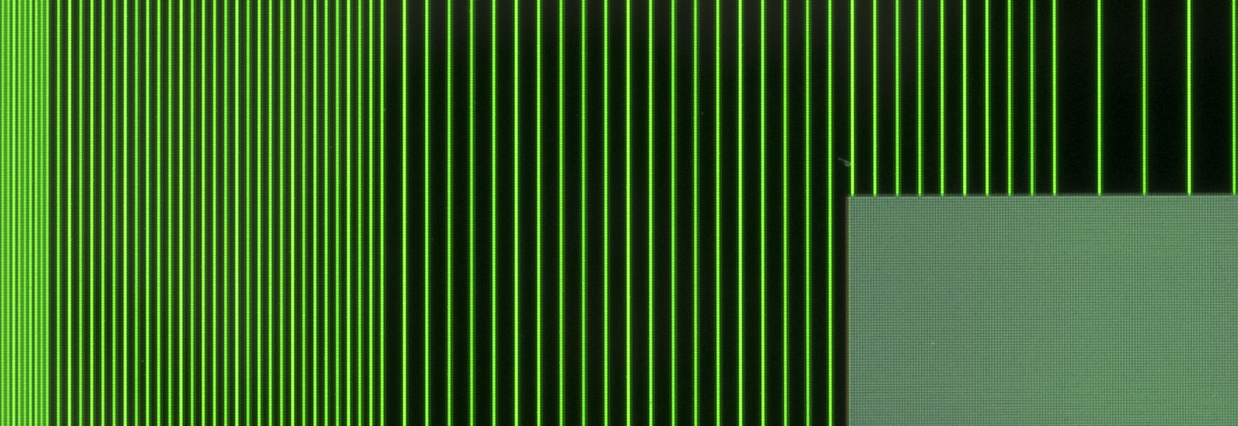
The visible image degradation is much more pronounced to the naked eye than the photos above indicate. We made a video that illustrates the effect quite well:
Next time you launch a game on an iPhone 6 Plus, see if you can notice the image quality degrade when you pull down Notification Center or change the volume.
1080p Video
The same effect can be observed during video playback. When you play a native 1080p video in fullscreen, iOS can do the same optimization and skip the scaling stage. Bringing the playback controls on screen requires blending the blurred toolbars with the video and causes a degradation in image quality.
I have never noticed this effect in a normal video but Hendrik Kueck demonstrates it nicely in this demo. You can use this video of a test pattern image to test this for yourself.3
Conclusion
Pixel-perfect rendering is a thing of the past on the iPhone platform. Having seen the rather severe results in the worst-case scenario (rendering a regular grid of hairlines), I am actually surprised how little of an issue the automatic downsampling is in practice. As I mentioned, I simply don’t notice any of the effects I have illustrated here in real life.
For developers, the best way to deal with the situation is probably to ignore it. Just do what Apple recommends and treat the iPhone 6 Plus as a 414×736@3× device and you’re gonna be fine in all but the most extreme corner cases.
Get the code on GitHub. If you have access to an iPhone 6 Plus, I encourage you to build the two demo apps and run them on the device. Seeing the effects in person gives you a better impression of the effects than the illustrations I can do here. Note that the apps have only been tested on an iPhone 6 Plus. It’s likely that the OpenGL code won’t run correctly on other devices because I hardcoded the pixel sizes.
Update: I came up with a better title for this article a few hours after publishing it so I changed it.
-
Throughout this article, I use the terms logical pixel and hardware pixel to distinguish between the pixels in the render surfaces (before downsampling) and the actual hardware pixels. ↩︎
-
Andreas is a fantastic photographer. I encourage you to check out his photos. ↩︎
-
You must download the video from Vimeo on your computer, save it to your iPhone’s photo library and then play it from the Photos app. I have not seen the effect when I played the video directly in Safari. I don’t know if that is due to some inherent limitation of Mobile Safari or just because the video that Safari streams is not actually 1080p.Update November 24, 2014: the effect can also be observed when you play the video in Mobile Safari, at least if your connection is fast enough for Vimeo to stream the full 1080p video. You may have to play it for a few seconds until Safari switches to the highest quality. ↩︎
